
CSS Grid
Grid
CSS 그리드 레이아웃(Grid Layout)은 FlexBox와 다르게 2차원적으로 레이아웃을 나타낼 수 있다.
테이블과 마찬가지로 그리드 레이아웃은 세로 열과 가로 행을 기준으로 요소를 정렬할 수 있다. 하지만, 테이블과 달리 CSS 그리드는 다양한 레이아웃을 훨씬 더 쉽게 구현 가능하다.
더 자세한 Grid 정보는 https://heropy.blog/2019/08/17/css-grid/ 참고
Auto Rows and Columns
auto-flow라는 속성은 flexbox의 flex-direction과 비슷한데 정의되지 않는 element가 추가적으로 오면 수직으로 정렬할건지 수평으로 정렬할건지 column or row로 정할 수 있다.
웹 페이지는 주로 수직으로 구성되기 때문에 grid-auto-row를 많이 사용한다.
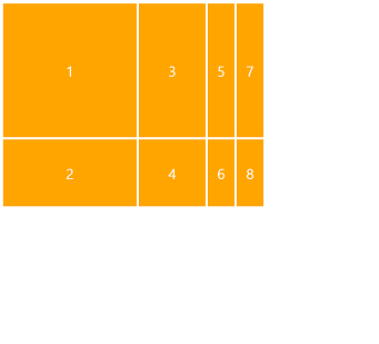
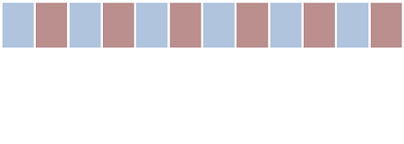
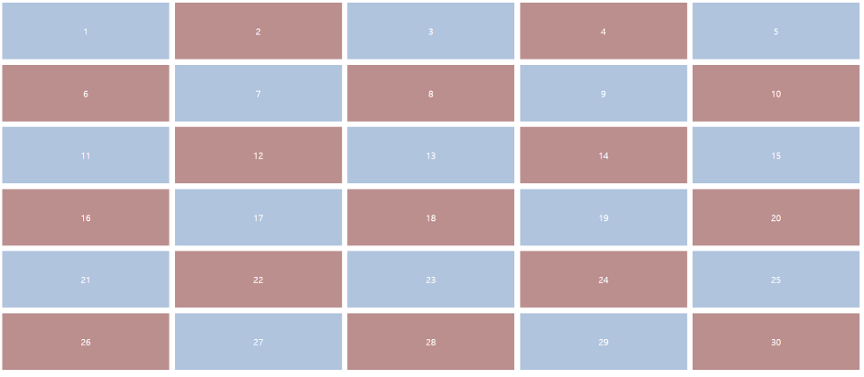
grid-auto-flow가 column 일때
.father {
  display: grid;
  grid-template-columns: 300px 150px;
  grid-template-rows: 300px 150px;
  grid-gap: 5px;
  grid-auto-columns: 60px;
  grid-auto-flow: column;
}
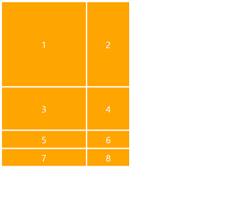
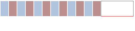
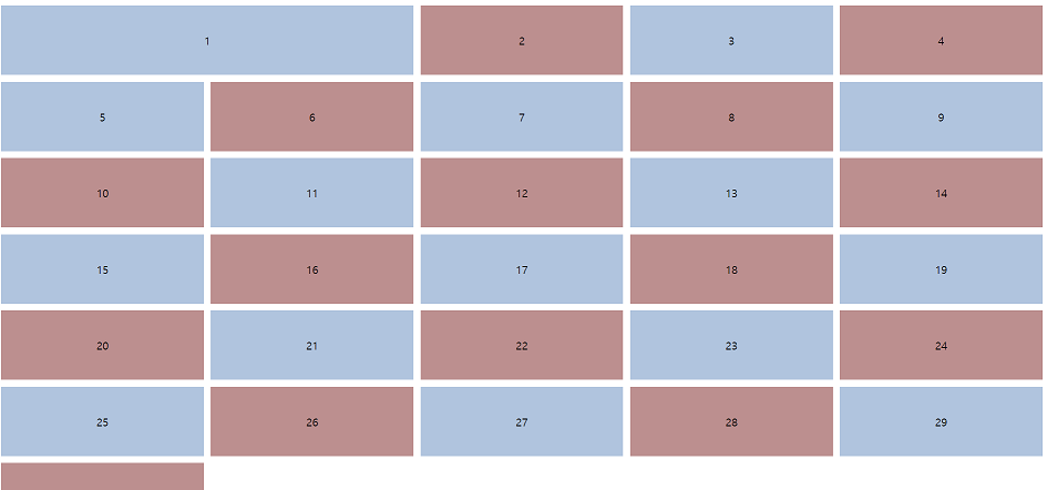
grid-auto-flow가 row 일때
.father {
  display: grid;
  grid-template-columns: 300px 150px;
  grid-template-rows: 300px 150px;
  grid-gap: 5px;
  grid-auto-rows: 60px;
  grid-auto-flow: row;
}
grid-template-rows and grid-auto-rows
grid-template-rows는 명시적인 그리드 크기를 정의할 때 사용된다.
grid-auto-rows는 grid-template-rows로 정의한 명시적 행 외부에 그리드가 배치되는 경우 해당 속성 값이 적용된다.
컬럼일 경우 grid-template-columns와 grid-auto-columns를 사용한다.
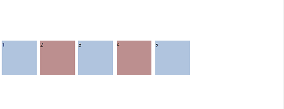
grid-gap (gap)
그리드의 행과 열 사이의 간격을 설정하는 shorthand로 지금은 gap으로 대체하는 과정중에 있다. 1개 값만 지정할 경우 row-gap 속성만 적용된다. 컬럼은 column-gap, 행은 row-gap으로 각각 사용할 수 있다.
div {
  /* 단일 <length> 값 */
  gap: 20px;
  gap: 1em;
  gap: 3vmin;
  gap: 0.5cm;

  /* 단일 <percentage> 값 */
  gap: 16%;
  gap: 100%;

  /* 이중 <length> 값 */
  gap: 20px 10px;
  gap: 1em 0.5em;
  gap: 3vmin 2vmax;
  gap: 0.5cm 2mm;

  /* 이중 또는 혼합 <percentage> 값 */
  gap: 16% 100%;
  gap: 21px 82%;

  /* calc() 값 */
  gap: calc(10% + 20px);
  gap: calc(20px + 10%) calc(10% - 5px);

  /* 전역 값 */
  gap: inherit;
  gap: initial;
  gap: unset;
}
fr and repeat
fr은 grid container의 크기를 상대적으로(relatively) 조절할 수 있는 단위이다.
흔히 말하는 반응형 디자인에 많이 적용된다.
.father {
    display: grid;
    grid-auto-rows: 150px;
    grid-gap: 5px;
    grid-template-columns: 2fr 1fr 2fr 1fr;
    /*grid box 마다 fr로 크기를 조절할 수 있다.*/
}
repeat는 column을 반복해주는것.
실제 grid container 갯수보다 repeat의 갯수가 더 많으면 자동으로 생성된다.
.father {
  /* 5개의 gird에 1fr 지정 */
  grid-template-columns: repeat(5, 1fr);

  /* 3개의 grid에 1fr 지정, 1개의 grid에 4fr 지정*/
  grid-template-columns: repeat(3, 1fr) 4fr;
}
참고! Internet Explorer 지원 안함
minmax, max-content, min-content
minmax는 grid container의 maximum과 minimum 크기를 지정해주는 도구이다.
minmax(창이 작아져도 유지해야 할 최소 크기, 최대 크기)로 지정할 수 있다.
참고! Internet Explorer 지원 안함
.father {
    grid-template-columns: minmax(400px, 2fr) repeat(3, 1fr);
}
max-content는 grid container 안에 있는 content에 기반하여 최대한의 크기를 가질 수 있게 해준다.
.father {
    grid-template-columns: max-content repeat(3, 1fr);
}
min-content는 허용할 수 있는 가장 적은 공간을 사용하라고 지정해준다.
.father {
    grid-template-columns: min-content repeat(3, 1fr);
}
auto-fit, auto-fill
만약 grid container가 얼마나 생길지 모른다면? auto-fit을 사용하면 갯수 지정 없이 자동으로 크기 지정이 가능하다. content를 stretch해서 browser를 꽉 채우는 것! 아래 예시는 가질 수 있는 가장 많은 column을 갖되 각 column의 크기는 1fr로 지정한 것이다.
.father {
    display: grid;
    grid-auto-rows: 100px;
    grid-gap: 5px;
    grid-template-columns: repeat(auto-fit, 1fr);
}
하지만 크기 자체는 flexbile 하지 않기 때문에 minmax를 응용하여 상대적인 크기로 변경 가능하다.
.father {
  grid-template-columns: repeat(auto-fit, minmax(50px, 1fr));
}
auto-fill은 허용 가능한 공간에 grid container를 미리 배정해둔 뒤 해당 cell이 입력되는 방식으로 작동한다. 즉, 빈 공간엔 ghost grid container가 생긴다.
.father {
    display: grid;
    grid-auto-rows: 100px;
    grid-gap: 5px;
    grid-template-columns: repeat(auto-fill, minmax(50px, 1fr));
}
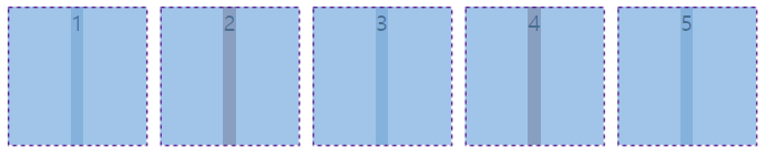
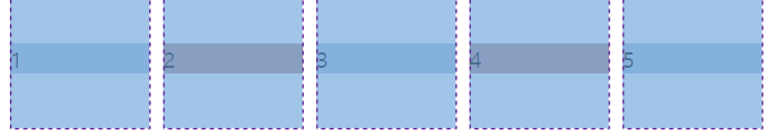
justify-content, align-content, place-content
justify-content 속성은 flexbox와 동일하게 grid container의 수평 축 위치를 조정할 수 있다.
.father {
  justify-content: flex-end;
}
.father {
  justify-content: flex-start;
}
align-content는 수직축을 조정할 수 있다.
.father {
  justify-content: start;
  align-content: center;
}
place-content는 justify-content와 align-content를 한번에 쓰는 방법이다.
첫번째 value는 align-content를, 두번째 value는 justify-content를 적용하면 된다.
중요! 두번째 값이 없으면 첫번째 값이 두 값에 모두 사용된다. 둘 중 하나라도 유효한 값이 아니면 전체 값이 유효하지 않게 된다.
.father {
  place-content: center start;
}
참고! Internet Explorer 지원 안함..완전 골치덩어리😥
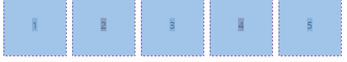
justify-items, align-itmes, place-items
grid container에 있는 content를 움직일 수 있는 속성이다. content은 확장되는 값을 가지고 있기 때문에 한쪽 속성만 설정하면 길게 늘어나게 된다. content 영역만큼 주려면 둘 다 속성값을 주거나 place-items를 사용하면 된다.
.father {
  justify-items: center;
}
.father {
  align-items: center;
}
.father {
  plcae-items: center center;
}
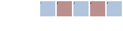
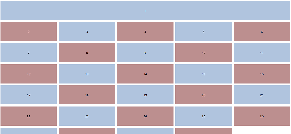
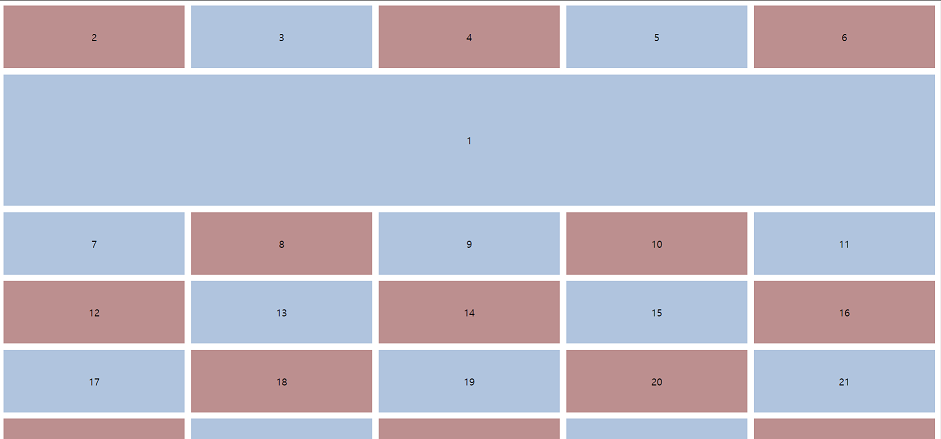
Grid Column, Row Start and Row End
아래처럼 그리드가 여러 개 있을 때 첫번째 그리드를 Header로 길게 보여주고 싶다면?
첫번째 line이 있는 곳에서 시작하고 세번째 line이 있는 곳에서 column을 끝낸다. column의 개념이 아니라 line의 개념!
.box:first-child {
    grid-column-start: 1;
    grid-column-end: 3;
}
아니면
.box:first-child {
  grid-row: 1 / 3;
}
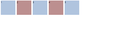
grid-column-end에 -1을 줄 경우 자동으로 맨 마지막 줄로 이동한다.
.box:first-child {
    grid-column-start: 1;
    grid-column-end: -1;
}
시작과 끝을 지정하지 않고 단순히 몇 칸의 공간을 사용하라고 지정하고 싶을 때 span을 사용하면 된다.
.box:first-child {
  grid-row: span 1;
  grid-column: span 5;
}
Line naming
line naming을 줘서 설정해줄 수도 있다. 자주 사용되는 건 아님.
.father {
    display: grid;
    grid-gap: 10px;
    grid-auto-rows: 100px;
    grid-template-columns: [first-line] repeat(5, 1fr) [last-line]
}

.box:first-child {
    grid-column-start: first-line;
    grid-column-end: last-line;
}
Grid Area
grid-area 속성은 grid-row-start, grid-column-start, grid-row-end, grid-column-end 값을 한번에 설정하는 shorthand property다. 4개의 값을 다 줄 수도 있지만 2개의 값을 넣으면 row와 column으로 각각 인식한다.
.box:first-child {
   grid-area: 2 / 1 / 4 / -1;
 }
justify-self, align-self, place-self
justify-items와 align-items는 모든 children을 변경하고 싶을 때 사용하지만
justify-self와 align-self는 특정 child만 적용하고 싶을 때 사용한다.
더 자세한 차이점에 대한 설명은 https://stackoverflow.com/q/48535585 참고
.box:first-child {
    justify-self: center;
    align-self: center;
    /* place-self: center center; */
}
Quiz
- What is a grid made of
Lines, cells, rows, columns - What property should I use to customize the rows generated automatically?
- What property decides if rows or columns get generated-
- What does the fr measurement unit do?
- What is the syntax for the repeat() function?
- How can I make a column respect a maximum or a minimum size
- How can I align the content INSIDE of the grid cells?
- How can I align the grid cells?
- How can I give space between the cells
Reference
https://developer.mozilla.org/en-US/docs/Web/CSS
https://heropy.blog/2019/08/17/css-grid/
Comments