
CSS FlexBox
Life Before Flexbox
div의 기본값은 block이며 옆에 어떤 element도 올 수 없다.

inline-block은 box를 element 요소로 바꿔주지만 block 속성을 갖고 있어서 너비와 높이를 갖고 있다.

하지만 div 간격을 조정하려면 box element 각각 margin을 설정해줘야 하는 노가다가 필요한데.. 이것도 스크린마다 간격이 깨지는 단점이 있다.
<!DOCTYPE html>
<html lang="en">
<head>
  <meta charset="UTF-8">
  <meta name="viewport" content="width=device-width, initial-scale=1.0">
  <title>Document</title>
  <style>
    .box {
      width: 300px;
      height: 300px;
      background-color: blue;
      display: inline-block;
    }

    .box:first-child {
      margin-right: 7%;
    }

    .box:last-child {
      margin-left: 7%;
    }
  </style>
</head>
<body>
  <div class="box"></div>
  <div class="box"></div>
  <div class="box"></div>
</body>
</html>

이걸 해결해주는게 바로 FlexBox다!
FlexBox
flexbox(flexible box module)는 flexbox 인터페이스 내의 아이템 간 공간 배분과 정렬 기능을 제공하는 1차원 레이아웃 모델로 설계되었다.
부모 element에 display: flex를 설정해주면 자식의 위치를 움직일 수 있다. 자식 div에다가 일일히 margin을 설정할 필요가 없어진다!
<!DOCTYPE html>
<html lang="en">
<head>
  <meta charset="UTF-8">
  <meta name="viewport" content="width=device-width, initial-scale=1.0">
  <title>Document</title>
  <style>
    .wrapper {
      display: flex;
    }

    .box {
      width: 150px;
      height: 150px;
      background-color: blue;
    }
  </style>
</head>
<body>
  <div class="wrapper">
    <div class="box"></div>
    <div class="box"></div>
    <div class="box"></div>
  </div>
</body>
</html>

Main Axis and Cross Axis
flex container는 width와 height에 의해 아이템을 정렬한다.
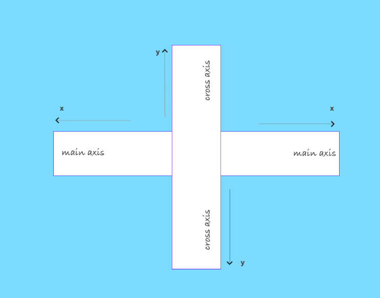
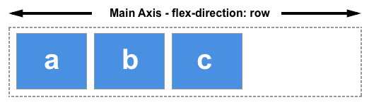
flexbox는 두 개의 축이 있다. flex-direction이 축에 영향을 준다.
flex-direction이 row일 경우 main axis는 justify-content가 영향을 주는 축이고, cross axis는 align-items가 영향을 주는 축이다.
따라서, main axis에 있는 아이템을 움직이려면 justify-content를 cross axis에 있는 아이템을 움직이려면 align-items를 적용하면 된다.
flex-direction이 column이면 축은 반대가 된다. (매우 중요하다!!!)
| flex-direction | justify-content | align-items |
|---|---|---|
| row | 수평 | 수직 |
| column | 수직 | 수평 |
더 많은 flexbox에 대한 설명은 CSS Flex(Flexible Box) 완벽 가이드 참고
flex-direction이 row 혹은 row-inverse일 때
.father {
  display: flex;
  justify-content: left;      /* main-axis */
  align-items: flex-start;    /* cross-axis */
  flex-direction: row;
  height: 100vh;
}
flex-direction이 column 혹은 column-inverse일 때
.father {
  display: flex;
  justify-content: center;      /* cross-axis */
  align-items: flex-end;        /* main-axis */
  flex-direction: column;
  height: 100vh;
}
Align Self
flex container가 아닌 flex item에만 영향을 주는 몇 안되는 옵션 중 하나
.box3 {
  align-self: flex-end;
}
Quiz
- What is the default direction of a flex container?
- By default, the main axis is ?
- How do I move items on the main axis?
- How do I move items on the cross axis?
- How can I align an element individually?
- How can I make the flex-items go to another line instead of shrinking
Reference
https://codeburst.io/understanding-basic-concepts-of-css-flexbox-ffa657dc39c1
Comments